Designing Shipping Address Flow for Better Checkout Experience
Speed up filling address by maximizing automation on each label in order to increase success rate during checkout process.
Product Designer
Background
Shipping Address plays a critical role in the checkout experience within Tokopedia’s purchase flow. Users are required to complete their address information before they can proceed with payment, making this step one of the most important parts of the transaction journey.
Because of this, the address creation flow needed to feel as seamless and frictionless as possible. However, the address creation success rate remained stagnant at around 72% from January 2018 to February 2019, meaning that nearly 1 out of 4 users failed to complete the process successfully.
Problem
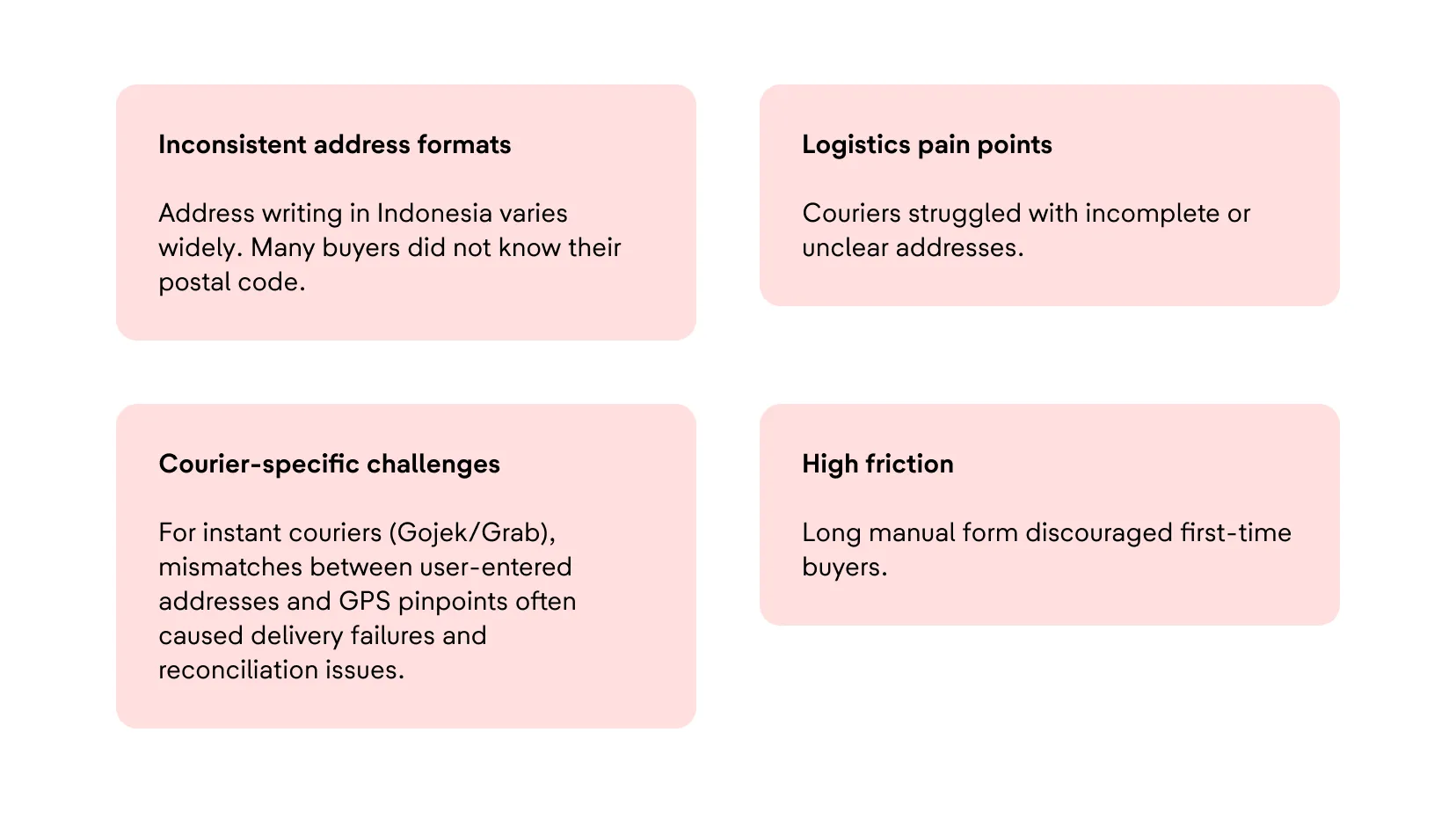
Several issues contributed to the poor completion rate and overall checkout friction. Indonesian address formats are highly inconsistent, and many users were unfamiliar with their own postal codes, making manual entry difficult.
Couriers also faced operational challenges due to incomplete or unclear addresses, especially for instant delivery services like Gojek and Grab, where mismatches between GPS pinpoints and written addresses often caused failed deliveries.
On top of that, the lengthy manual form created high friction, particularly for first-time buyers who were already unfamiliar with the checkout process.
Start to understand
To better understand the issue, I collaborated closely with the data science team to analyze user behavior across the later stages of the checkout funnel, from Cart to Payment.
By identifying where users dropped off, we were able to uncover potential opportunities for improvement. In parallel, we also conducted usability testing sessions to validate assumptions qualitatively and gain a deeper understanding of user frustrations and behaviors during the address entry process.
Funnel Data Analysis
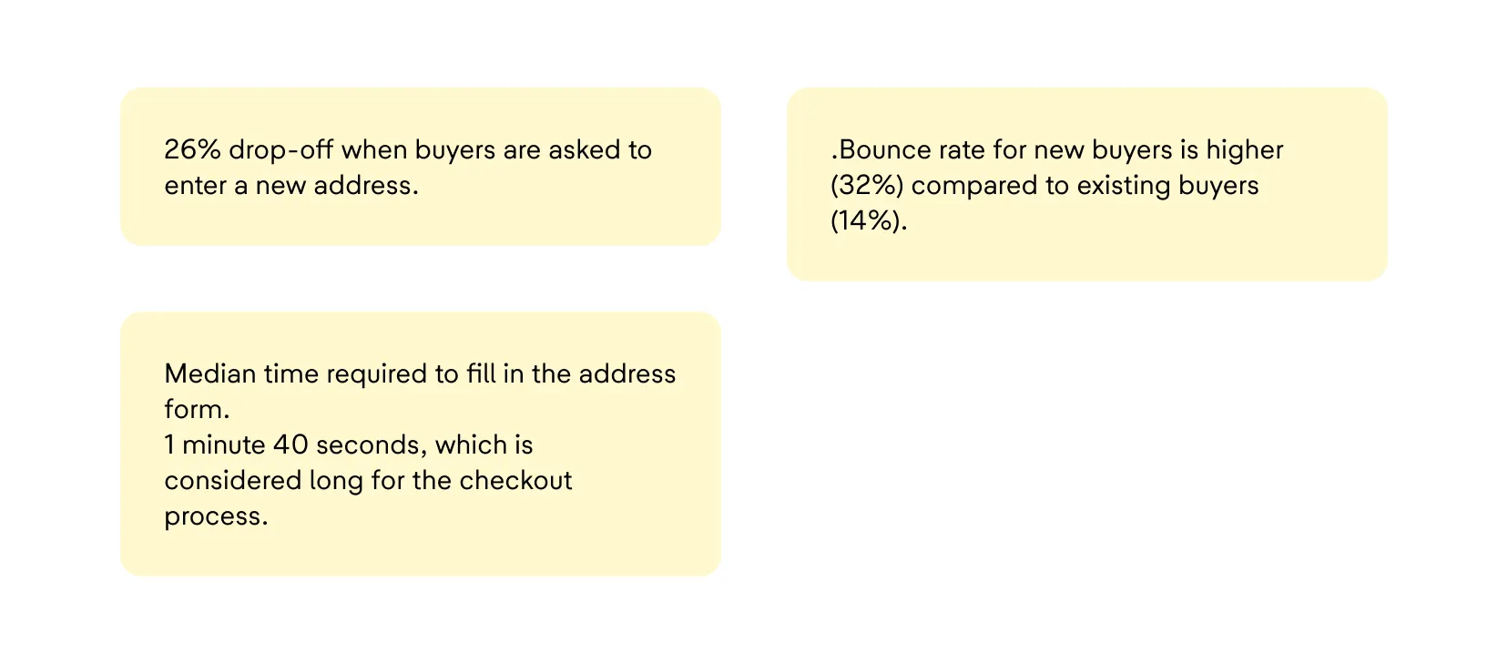
The checkout funnel analysis revealed that 26% of users dropped off when asked to create a new shipping address.
This issue was even more severe among new buyers, who showed a bounce rate of 32%, compared to only 14% for existing buyers.
In addition, the median time required to complete the address form was 1 minute and 40 seconds, which we considered too long for a checkout experience where speed and convenience are essential.
Usability Testing Sessions
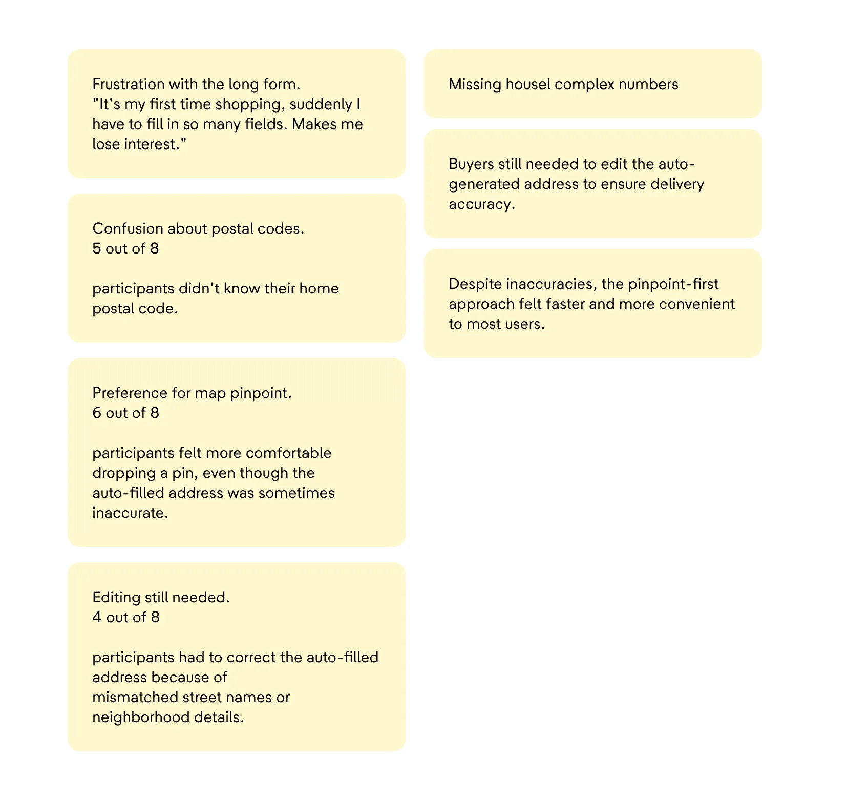
We conducted eight usability testing sessions with new buyers to better understand their pain points. Many participants expressed frustration with the lengthy form, especially during their first shopping experience.
Several users also struggled because they did not know their postal code.
Interestingly, most participants preferred using a map pinpoint interaction because it felt faster and more intuitive, even though the auto-generated address was not always accurate.
In many cases, users still needed to manually edit the generated address to add missing details such as house numbers, building names, or neighborhood information.
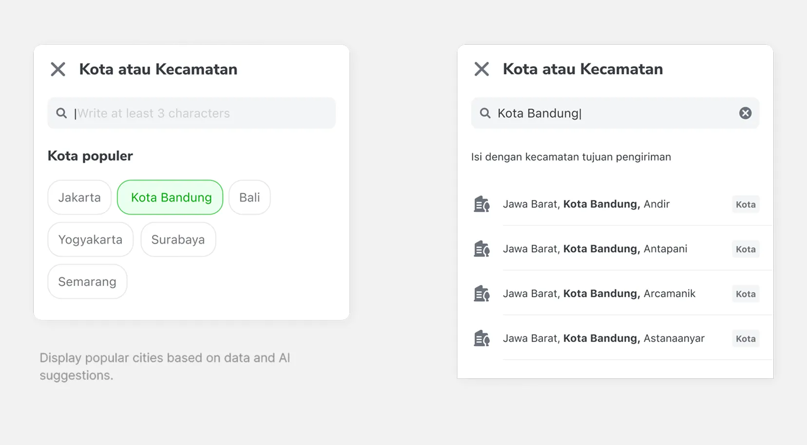
Solutions
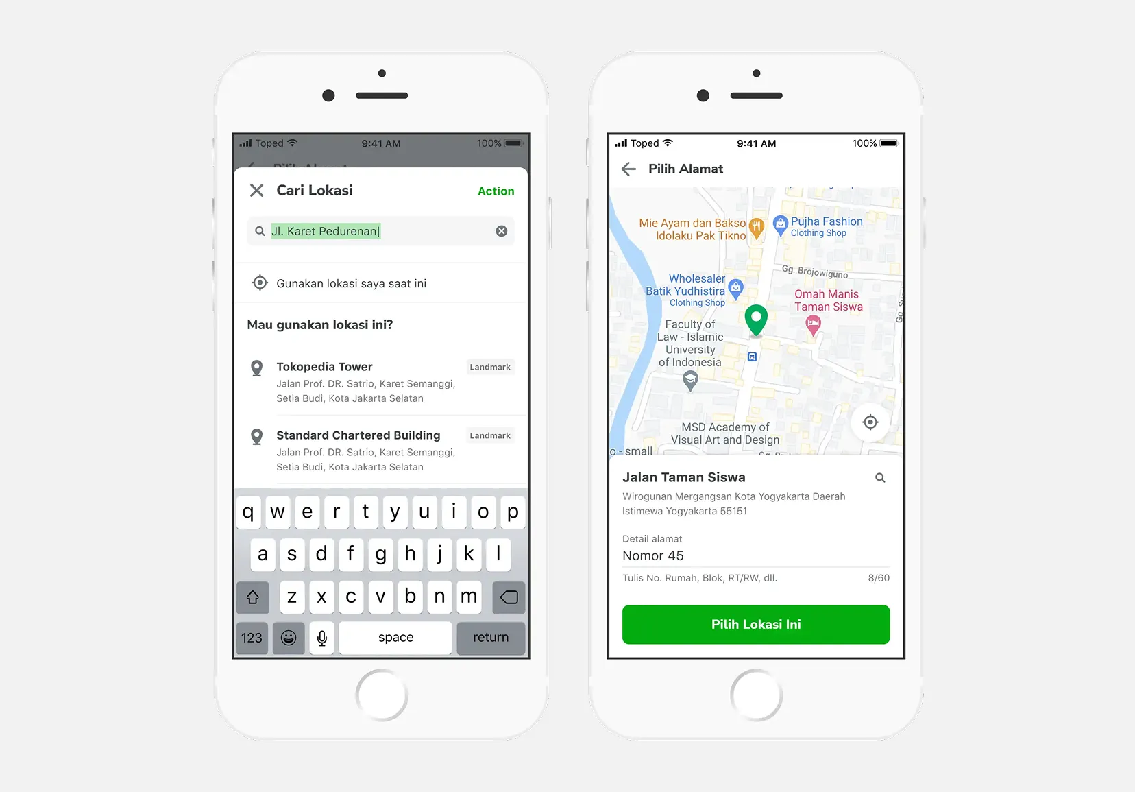
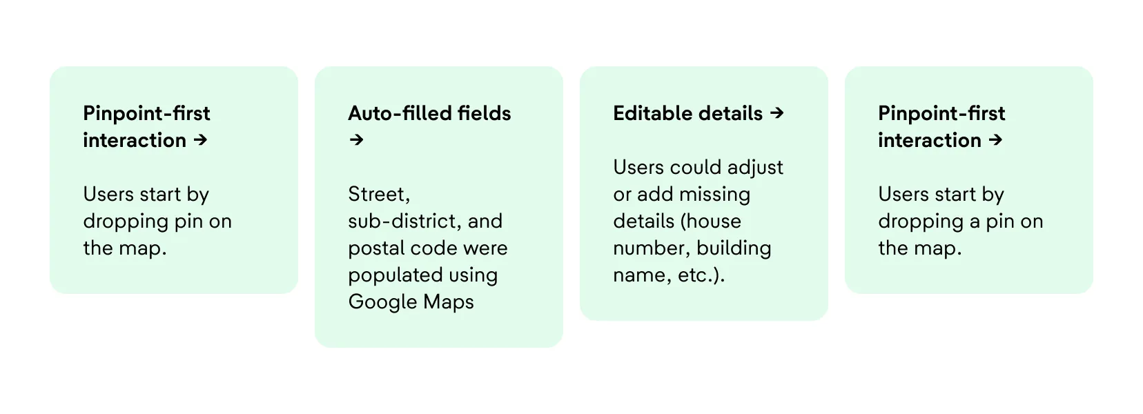
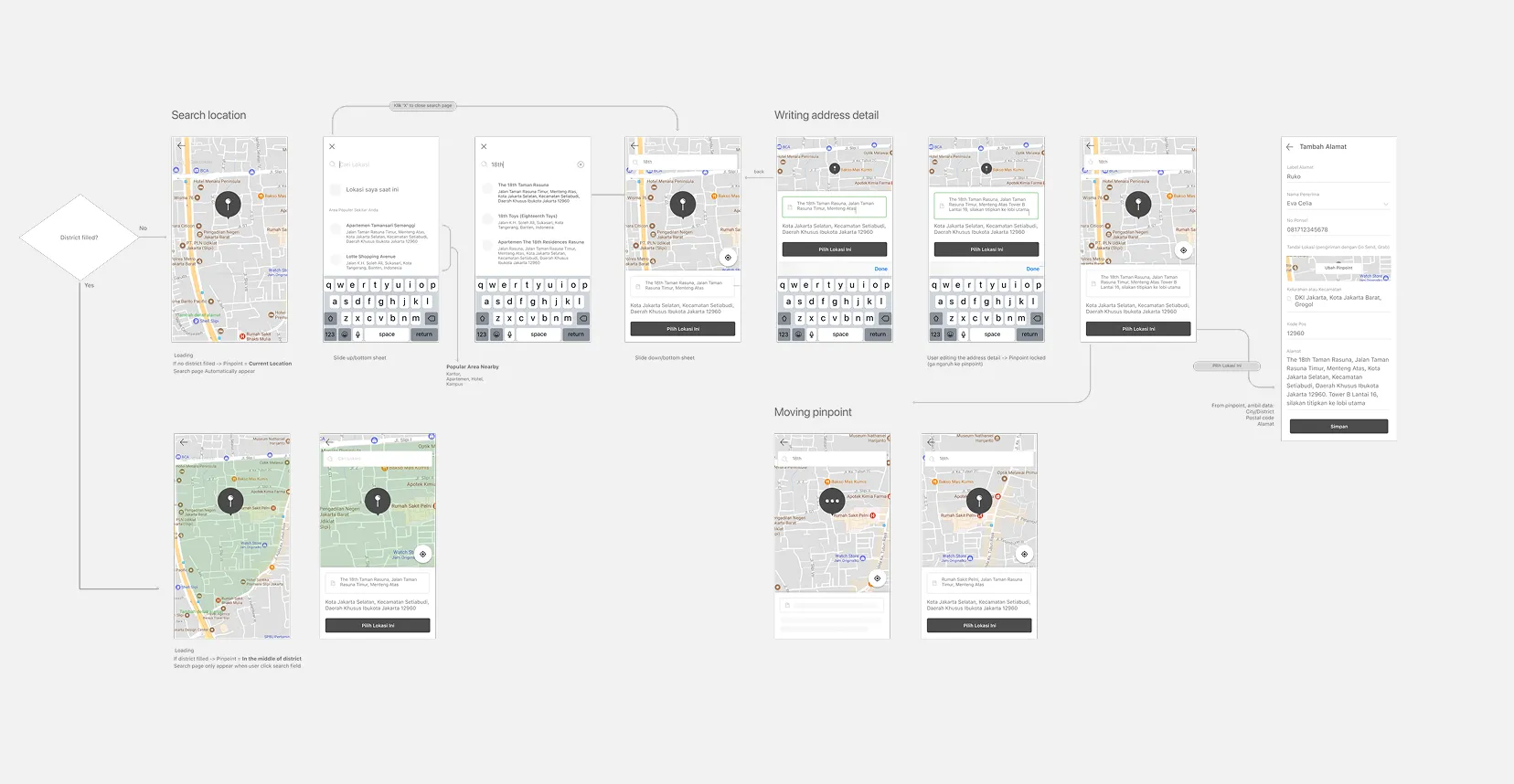
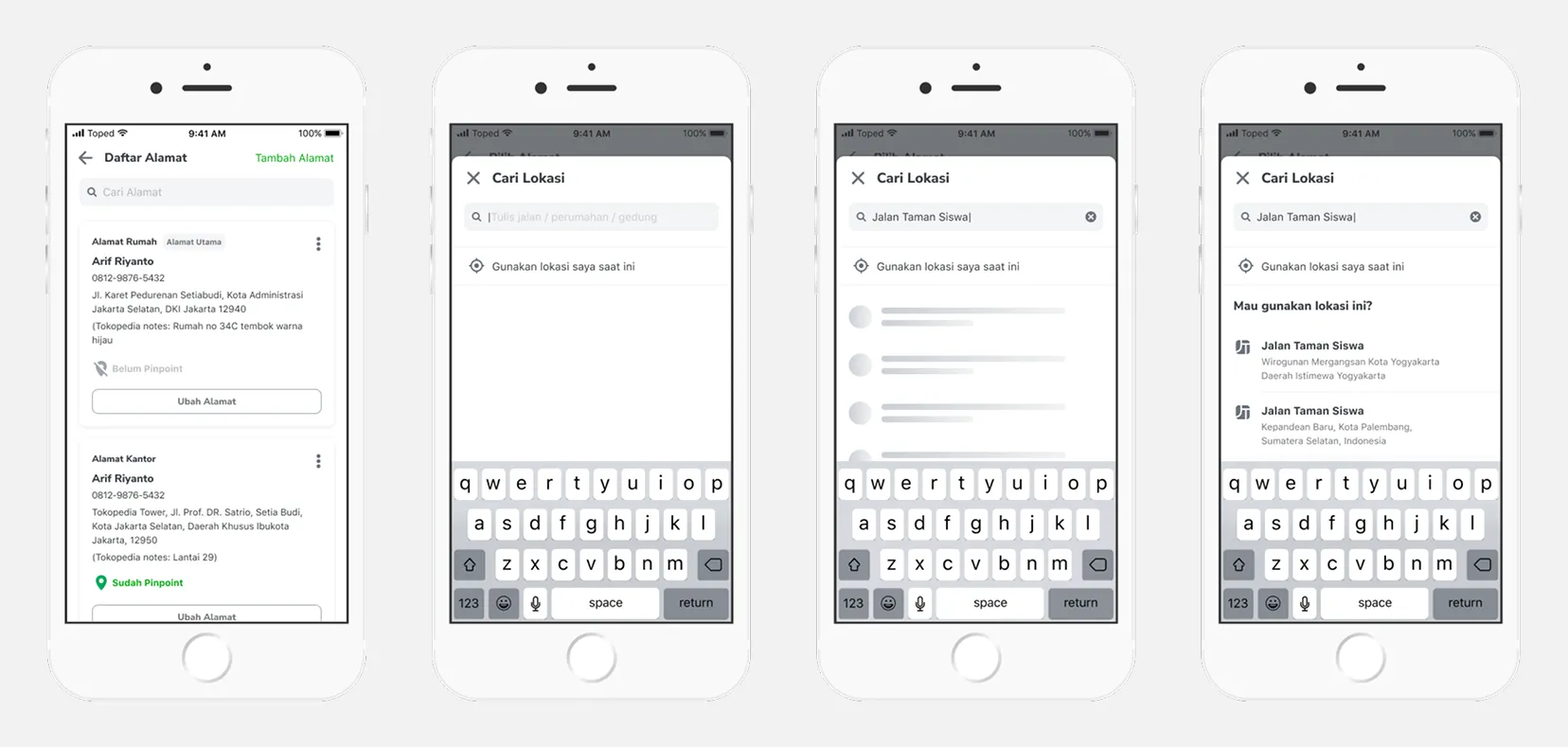
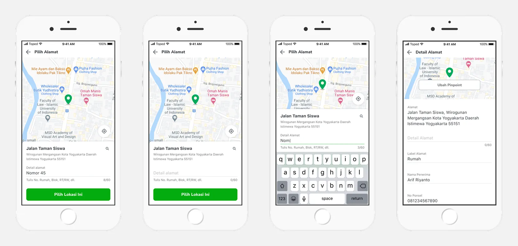
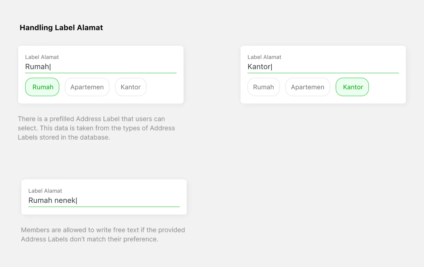
To reduce friction and simplify the process, we redesigned the address creation flow into a pinpoint-first experience supported by auto-filled address data.
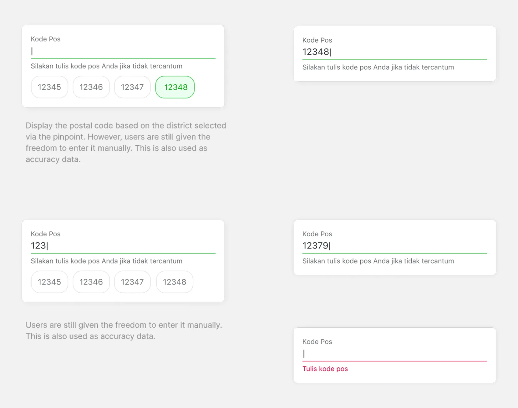
Instead of manually filling every field from scratch, users could begin by dropping a pin on the map. The system would then automatically populate important fields such as street name, sub-district, and postal code using Google Maps data.
Users still had the flexibility to edit or add missing details manually to ensure delivery accuracy. This approach helped balance convenience with logistical reliability.
Design Exploration
During the design phase, I explored a wide range of approaches, including restructuring the user flow, refining layouts, and experimenting with various micro-interactions.
The objective was not only to simplify the experience, but also to discover interaction patterns that could meaningfully improve the overall checkout journey while maintaining operational feasibility for logistics partners.
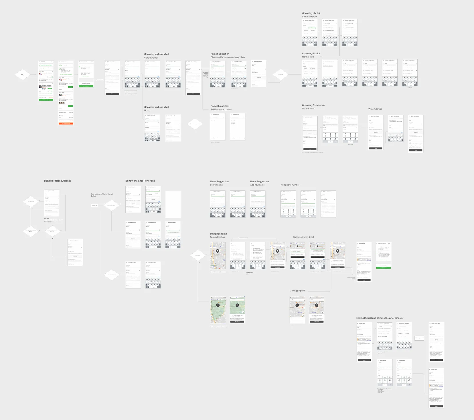
Iterations & Challenges
The project went through multiple rounds of iteration, including A/B testing and repeated usability studies.
We tested several approaches, such as a pinpoint-only flow versus a hybrid flow with editable fields. We also refined the copywriting and step sequence to reduce user drop-off during checkout.
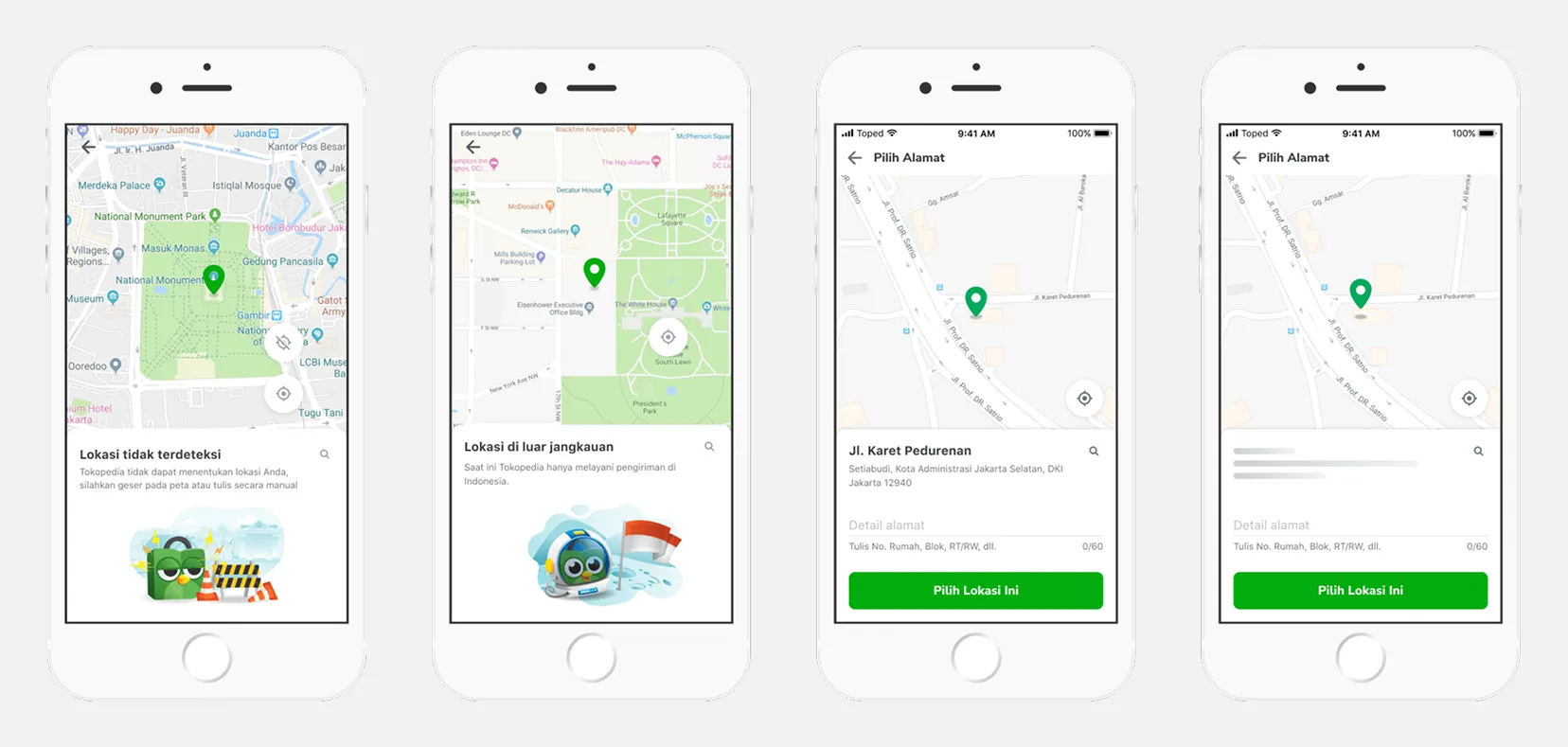
One of the major challenges was adapting Google Maps data to better align with Indonesian address conventions, including improving postal code accuracy and handling incomplete or inconsistent external data.
The biggest challenge throughout the process was balancing low-friction user experience with the operational accuracy required by couriers and logistics systems.
Other Findings
- Google Maps data was never 100% reliable.
- Balancing low-friction UX with logistical accuracy was a constant trade-off.
- Designing an interface flexible enough to handle incomplete or incorrect external data.
General Results
Explorations: We ran multiple rounds of A/B testing and usability studies:
- Tested pinpoint-only flow vs pinpoint + editable fields.
- Refined copywriting and step sequence to reduce drop-offs.
- Manipulated Google Maps data to better fit Indonesian address conventions (e.g., postal code corrections).
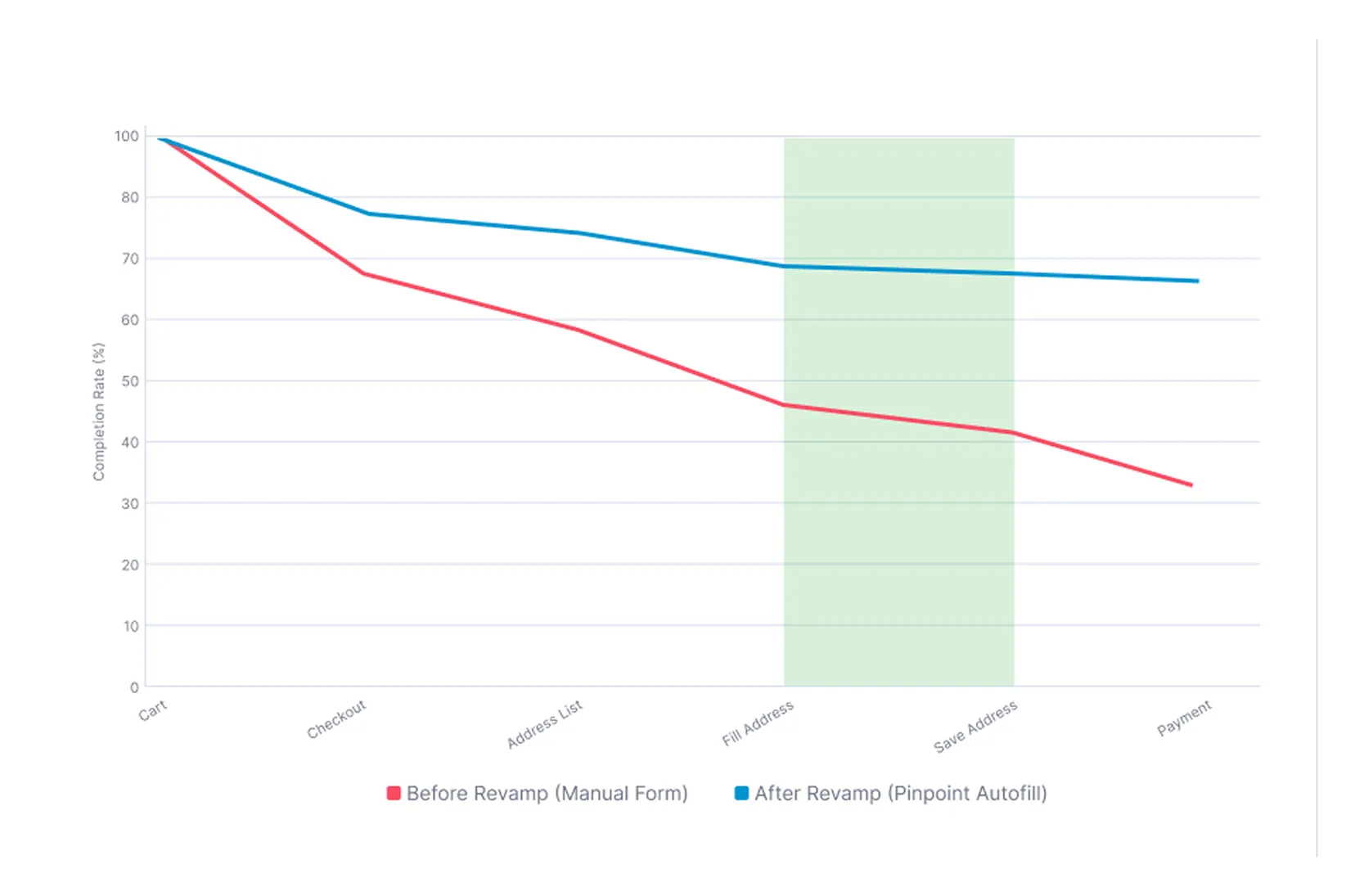
Result & Impact
The redesigned flow delivered significant improvements:
- Reduced bounce rate in Checkout for new buyers.
- Higher address completion success rate, as users were more likely to save addresses via pinpoint.
- Improved courier delivery accuracy, especially for instant couriers using GPS data.
- Positive user feedback: buyers felt the process was faster and less confusing.
Closing Thoughts
This project reinforced several key lessons:
- Design for local context: Indonesian addresses differ greatly from Western standards, requiring localized solutions.
- Bridge UX and operations: Great design must also solve real logistical challenges for couriers and merchants.
- Data-informed iteration: A/B tests and UT helped refine the flow, but the product still had to gracefully handle imperfect data.